Showing posts with label Scrapbook Challenges. Show all posts

Sunday, August 2, 2015

Christmas In August

Hello blogging world!  Bet you're surprised to hear from me, huh?  It's hard to believe that I haven't updated this blog in so long, but sometimes real life just gets in the way of the virtual one.  In my case, it's been REALLY in the way.  But that's a story for another day.

Today, I want to talk about tags. Specifically Tim Holtz and his 12 tags annual project.  Those of you who know me know that I embarked on the journey of finishing all five years of the Christmas tags, and while I'm not done yet (close though) - it occurred to me that it might be fun to see if I could put a Christmas spin on his tag of the month for this month.  Here's the link to Tim's project … 


And here's my spin on it.  


I love Tim's creative brain, and I really love how simple he makes everything seem.  His techniques aren't really complicated, his instructions are super easy to follow, and he encourages you to use the supplies you have and gives you an opportunity each month to try out a new product or technique. 

I used my Christmas Holiday Words Die to create the die cut background, and then backed it with some Merry Christmas word paper that I had lying around in my stash.  I think I may have found a new favorite product - this Multi-Matte Medium is pretty amazing stuff!  It was a snap to use and the drying time was really amazing.  I expected to have to wait for it to set up for hours,  but just a matter of minutes and it was ready to go.  

I inked up with Forest Moss, Peeled Paint, and Pine Needles Distress Inks.  The Distress Ink palettes are really such a super line - the colors are rich and vibrant and so vintage it's hard to pick a favorite!  

I am blessed to have a whole stack of vintage Christmas cards dating back to the 60's - thanks to my grandparents' saving habits.  I used the multi-matte medium to adhere the Santa image from one of those cards to some white card stock, then fussy cut and adhered him to the tag with more medium.   The Book came from and old K&Co Yuletide package that's in my 12-tags stash drawer - adhered with more Multi-Matte Medium.  Same with the cut out words.  

I went with Walnut Stain Distress Pen and Ink instead of the Black Soot to finish the edges.  The brown just seemed a bit softer for what I was trying to accomplish here.  

The holly is an old Kaisercraft product, the red buttons are from my vintage button box, and the alphabet stamp is from StampinUp.

I'm really happy with how this little tag turned out.  I'm planning to add it to my Christmas Tag Garland - which is probably going to have to have another panel put in this year.   Thanks for peeking in on my little project.  This was kind of fun, this getting back to my virtual world.  Maybe I'll do this again soon.   I'm going to finish the Christmas Tag project this year for sure!  I'm on a roll!   


Monday, March 4, 2013

Nuts About Sketches - Design Team Round Two!


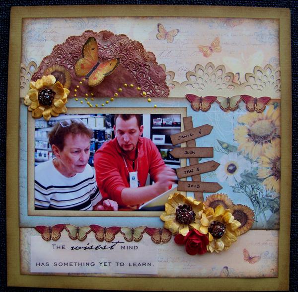
I love working with Shawn and using her sketches to create beautiful projects, so I'm honored and excited to be invited to continue with my Design Team position at Nuts About Sketches.  This layout is one that I turned in with my application.  

My mom, age 74, retired before personal computers were standard issue for teachers, and she really only uses her home computer to play solitaire. But recently my sister and I decided that her rich knowledge of the Bible and her incredible teaching ability needed to be out in the world.

Mom has, for years, wanted to write, but her health issues with her cancer recovery and an old heart surgery, coupled with her age, make sitting at a desk for long periods not really an option. Blogging seemed to be a perfect solution. But to do that, she was going to have to enter the computer age and buy a laptop. My sister said, "ONLY a Mac - nothing else. And you'll have to talk her into it. She won't listen to me." So, it fell to me to bring mom into the computer age.

At first, she resisted the idea, but surprisingly, only for a couple of minutes. I told her, "we'll get you a laptop, and a lap desk, and you can do it from your recliner. You sit there watching television anyway, and you can do this at the same time." Then there was a whole conversation about the logistics. Mom, and if you knew her you'd laugh, had very clear ideas of what her keyboard and her screen needed to look like. I said, "ok, let's just go to the Apple store and see what's there, and we'll find what you need."

I did a quick internet search for lap desks, and found that one that would work that we could pick up in the same mall as the Apple store, so I met mom in Tulsa and we looked first at the Mac Books. Mom got a little excited when she saw how simple they would be to use. But before we bought it, we measured it and then went upstairs to Brookstone to check the lap desks. I almost lost her when I sat her down in the big massage chair to rest a few minutes. She took a sales tag and asked the sales clerk, "do you deliver..."

The lap desk was perfect -which I knew because I'd researched and found the #1 best one out there - and she bought it. Then we went back down to Apple and she bought her MacBook Pro 15 inch retinal display, top of the line model. Then she signed up for the One to One program.

Since early December, I've been driving to Tulsa one day a week, meeting mom for lunch, and going with her to her One to One lesson so that when she forgets what her tech tells her, she can call me and I can help her with it. But she's a good student, and she is learning fast.

This photo is of her and her favorite tech, Josh, who looks for her name on the list when he's scheduled because if she's on there, he wants to work with her. I think that makes him one of the sweetest guys on the entire planet.

And as a pure bonus for me. When my DH asked me what I wanted for Christmas, I said, "A MacBook Pro" and he took me to the store and bought me one. So now I do a little one-to-one myself.

If you've gotten this far, thanks for listening to me ramble on (and on and on).

Monday, February 18, 2013

Art Journal ? - Swirlydoos Round 5 Project

Our assignment this past week was to create an art journal.

I'm not an artist. I don't draw, and I don't see art in my head.  I love to scrapbook because it allows me to create a beautiful art project with limited artistic skill.  

I had a good go at it, and more importantly, I had LOADS of fun.  My whole journal, however, ended up looking like a 6th grade art project.  I kept hearing, "it's YOUR art..." and, well, I DO teach 6th grade...

I'm pretty sure I'll get kicked this week.  I'm not kidding when I tell you that I really, REALLY did not have clue ONE about what I was doing.  And the other projects were SO incredible, it's fair I should go... 

I have to say, though, that this will probably be something I'll continue to play with because it really IS a lot of fun, and since I'm not a card maker, I might as well be an art journalist.  

This was one of three page spreads I did. It was my favorite of the week, so I figured I'd load it and share it here.  

I mean - it's ART, right? 


The sand is bead gel with paint. The bricks are modeling paste with metallic paint. The wind - that's just a doodle around a mask with some stickles to bling it up a bit. The water is done with a scallop punch and layers of paper.   The sailboat is some paper piecework.  I used a clip art shape as a model and some old canvas paper for the sails.  The wave is a chippie, colored with some Lindy's Mist.  I do love Lindy and her mists!  The clouds are gesso.  And yes, that's a toothpick you see on the bow of that boat.    


If you want to see what a REAL art journal looks like, go take a peek in the Week 5 Contest Gallery at Swirlydoos.  There are some AMAZING projects over there.  

Swirlydoos Ultimate Design Challenge - Week 5 Gallery


Friday, February 15, 2013

Paper Mixing Bowl - Red Velvet Cake

It's reveal day at the Paper Mixing Bowl.   

Wow, what a great sketch and recipe card this month!  It's a Red Velvet Cake with oodles of gooey frosting, spills, and stains.  I had a great time playing with the sketch.  I knew as soon as I saw it exactly how I wanted my project to turn out.  I'm so excited to show you my February "Valentine," even though the photographs are from last Christmas.  


Here's the recipe card.


Utensils I used
*Layers - I think there are twelve layers in this project, counting the layer of paint from the Martha Stewart doily silk screen and the title font letters.  
*Frosting - I used a gloss gel medium to get enough sticky for those glass beads to want to stay on my page.  I kind of globbed and smeared it like frosting along the top to look like drips.
*Pairs - Two pairs of photos:one pair looks left, one pair looks right.  Two pairs of small roses in each cluster.  One pair of white tulle in each flower cluster.  A pair of spilled beads, one spill on the top, one on the bottom.  A pair of doilies.  A pair of glitter heart brads. 
*Postage Items - I used a Post Card stamp.  It's stamped in brown and embossed in clear.  
*Spills - I misted my photo mat paper really heavily and then stood it on end so that it would run down the paper and look like a spill.  I spilled mist onto my craft mat and used it to wet my paper so that I could crinkle it up and then dry it out flat to create all those beautiful creases.  I spilled the glass beads all into the gloss gel.  And I tried hard to create a look of spilled frosting along the top margin of the paper.  
*Hearts and Flowers - Large and small roses, metal and glitter heart brads.  
*Multi-Photo - My muse is my beautiful older daughter, being herself, last Christmas.  

I went with the journaling prompts of "love letter" and "poem."  The mat and post card papers are word prints.  And the poem -- well, it's kind of a subjective interpretation, but I kept hearing the theme song from Lady In Red with Richard Gere and Julia Roberts...It inspired my title and that swinging red dress charm.  


Tuesday, February 12, 2013

Canvas Art - Swirlydoos Round 4 Project

So, as promised, here's my canvas project from last week's Swirlydoos Ultimate Designer Challenge.  

I've never even attempted such a project before, but Lisa is an awesome teacher and the video tutorials that she put up were AMAZINGly helpful for a total novice like me. It's a credit to HER that I was able to create this piece of pretty.  Thanks so much Lisa, for helping me get this project out of my head onto the canvas. 


Before I explain HOW I did it, let me tell you what it is and WHY I did it...

This canvas is a gift for my mother.

I am one of five children, four living. My parents lost a baby to SIDS at nine days old. Her name was Amy Susan and she died the day before my fifth birthday. She would be 52 this year. My younger daughter is named after her.

She was here such a brief time and it was so long ago that it's almost like she was never here at all. We never mention her, and yet her small but short life made a major impact on my parents.

My mother was 23 years old, my dad 31. Daddy was a US Marine, a fighter pilot, in charge of a squadron of other pilots, competent and sure of everything. Mom was busy keeping house and raising children, teaching Sunday School, hosting teas for other officer's wives.

Before Amy, my parents had a very clear idea how things were supposed to be. They expected life to follow certain rules and order. They had plans for the future - both theirs and their children's. After Amy, they both realized that sometimes children don't live to grow up. Their perspective about the future changed, and they both became better parents. My 'father' became my 'daddy,' and my mother found time to sit and play and hug us every opportunity she had.

As my mom has gotten older, she has begun talking about Amy, about how this little angel changed her life - how in one second, everything she knew for sure became nothing for sure at all. How the few short days she was with us changed ALL of us for the better, in spite of the incredible pain of loss.

There are no photographs of my second sister. The only mementos of her life are a photo of her grave and a small piece of ribbon, left over from the dress my mother buried her in.  A few years ago, I asked my mother for the ribbon from that dress. 

I had this idea in my head - just an idea really, nothing solid or formed - but some way to create a small memory of a short life that was part of my life, just for a few days, but made everything about the way I grew up different than it might have been if she had lived.

So to start, I chose a small canvas (8x8) to create my project - as a symbol of a small life, gone much too soon, before it even had a chance to BE a life really.  The ribbon on the bottom is the ribbon from her dress. And on the back, just for my mom to read, are these words...


What kind of place would heaven be with all its streets of gold,
if all the souls, that dwell up there like yours and mine were old?


How strange would heaven’s music sound when harps begin to ring,

if children were not gathered round to help the angels sing.


The children that God sends to us are only just a loan,

He knows we need their sunshine to make the house a home.


We need the inspiration of a baby’s blessed smile,

He doesn’t say they’ve come to stay, just lends them for awhile.


Sometimes it takes them years to do the work for which they come.

Sometimes in just a day or two our Father calls them home.


I like to think some souls up there bear not one sinful scar.

I like to think of heaven as a place where babies are.

**********

Now, here's how I did it. 

I prepped the canvas with glimmer mist in Snow Angel, Sunkissed Peach, Frost, and Patina. I was going for an "earth to heaven" color blend. 

I used molding paste for the wings, created with a stencil. The stuff on the bottom is called glass bead gel, bought at Michaels in the art and paint section. It's my NEW favorite goop!

I set it aside for the night to dry.

When everything was dry, I dry brushed the wings and the Bead Gel with some Metallic Pearl White paint by Folk Art. I also used some Baby Pink Metallic by Martha Stewart as well.

I stamped the clocks and embossed them with a soft peach embossing enamel. The cherub is a transparency print. I knew it would bleed a bit when I sealed the canvas, but I think that I like the way it ended up, soft at the bottom and clear at the top.

I sealed with Martha Stewart's glitter finish, another really COOL goopy item!

And another drying wait.

Then I top dressed the wings again with the Metallic White and finally used a white gelato stick on both the wings and the bead gel.

The chipboard is prepped with DecoArt Metallic Festive Green paint, run through my dotted swiss embossing folder.  Then I sanded the tops down, used some Peeled Paint ink and then some Metallic Chalk Rub to finish.

The fiber is a medical gauze roll. I pulled the fibers apart to make it more wispy and then treated it with a Baby Pink metallic paint wash. I tied the little dress ribbon in a bow, then tacked down the ends, kind of bunching and gluing as I went.

The little crochet butterflies started life white, but I gave them a bit of a dressing with some Picked Raspberry ink. The pearl bling finished everything up and I was done.

I am so pleased with how this turned out. I cannot wait to give it to my mom.

Saturday, February 2, 2013

Swirlydoos Ultimate Design Challenge Week 3

Want to see what's been keeping me busy this week?  I mean besides substitute teaching and feeding everything with a mouth around here?

I made the Round 3 cut for the Swirlydoos Ultimate Design Challenge and got to play for another week.  This week's project was courtesy of Miranda - who expected us to ::GASP:: work with METAL!  Oh dear.  Does she not know about my long standing feud with all things steam punky and industrial?  In fact, I have such a hard time with this particular genre' that I've invented my own signature style and named it "Country Punk" just in desperation to prevent being laughed out of next county. 

No matter.  Metal foil tape, embossing, and altered items.  That was the assignment, so up with the rolling of the sleeves, and down with the lump in my throat, and into the mucky mess with my fingers, and out came ....

this.  Which is not so bad, if I say so myself.  Turns out - it really was super fun.  But once again, steam punk and I have agreed to part ways in favor of a more "country" flair.  My signature "Country Punk" strikes again!  


It's a metal coated mini album covered with bits and pieces of things I love and things that I mostly wanted to get out of my bottomless stash of bits and pieces of things.  

The little wood fence lifts up.  Under, there is a little red glittered heart and some ribbon grass.  Eventually, this will have a picture of Cowboy as well. 


The little flower in the heart is one of Amy's earrings.  I found it in the bathroom drawer after she moved out.  There was only one, not a pair, and I could not bear to throw it out.  I knew I'd find a use for it.   Turns out...


The little metal butterfly is tethered to the family word.  I think that's kind of symbolic.  Everyone needs to find their wings, but our family keeps us stable and secure and grounded when the wind gets too strong and we need a safe resting place. 


The feathers are courtesy of my chickens and the bluebirds that live here in the summer.  The bingo numbers - lucked out with those.  They're our house number! 


Saturday, January 26, 2013

Swirlydoos Ultimate Design Challenge - Week 2

Hi everyone.  

This is my second project for the Swirlydoos Ultimate Design Challenge, which means that I made the first round cut!  I'm so excited - because the competition and talent is FIERCE.  This challenge is definitely a mojo stretching, creativity inspiring, pull out all the stops, pedal to the metal kind of competitive series.    

Our video inspiration tutorial was hosted by Rae this week. Rae is into layers - the more the better. Not surprisingly, our assignment then was to create a layered project. Rae didn't SPECIFY how many, so it turned into a really fun competition between participants of "just how many layers can you GET on that page of yours anyway?"

First item of business, I needed to pick a photo to work with.  

My sister and I went to Italy in October, and we made a point to take a "sister picture" at every major stop. This one is at the tower in Piza. The photo - my sister was my matron of honor and I was hers. We did this same photo at both of our weddings - 25 and 30 years ago. I thought about doing a then and now thing, but this photo is really for my Italy vacation album, so I'll save that idea for another time.

I actually already scrapped this photo once for my mom's mini album. But I wanted to do a layout of it for my own album, so I've been looking for the right set of circumstances to line up. This week, they did.


I'm going to play this project in a couple of additional challenges at Scrapbook.com.  The first is the Book Of Me Challenge which Char hosts.  The assignment this month was to scrap a milestone.  If a trip to Italy for a country girl from Oklahoma isn't a milestone, I'm not sure what is. It was also the first time my sister and I had shared a room since we were kids. It was so fun to find out that we could be friends as well as sisters. I had such a GREAT time. I mean, yeah it was Italy, but I went with my SISTER. How cool is THAT?

And I'm also going to submit it to Kimberly's Stamping On Your Layout Challenge because I did. Honest. I stamped some script writing on these papers in a couple of places - but I don't think that it shows up too well in the photo. Look really hard at the right edge of the brown polka dot paper and MAYBE you can see some of it. There's more, but the dark ink just doesn't show up well on the dark paper. You can see it in the real life version, but its subtle.


*************

TECHNIQUE DETAILS - for inquiring minds...

Day One was all about the papers. First item of business was that BoBunny Weekend Market collection. That was a total no brainer.  As far as I'm concerned, BoBunny knocked it out of the park with this paper line. It's one of my all time favorites - right up there with Kay & Co's Blue Awning.

I stopped counting paper layers at 11 because that's my lucky number, but I think that there actually ARE eleven layers of paper on the basic bones of this project. The mist work on the doily is Lindy's Buccaneer Bay Blue Moon Shadow Mist. (Moon Shadows are my FAVORITE Lindy's product.) 

Then I let the project marinate overnight.  It needed a serious time out.  It was arguing with me about flowers.  I wanted to use some fabric burlap and organza ones.  My layout wanted to live with cluny lace and wind up roses.  It was being seriously bossy about it too, and I just couldn't deal, so I left it all by itself overnight to think about the consequences of its choices.    

Day Two - I figured since the project was about layers, and since my project and I were STILL arguing about flowers, I decided the embellishments could stand a little layering too.

First is the little Italy stamp in the memo pin.  I had two of those stamps, so I cut one out with my stamp scissors, put it onto some chipboard, then put that on top of the other stamp, so it's a layered embellishment. The doily clock is another one. The doily is a diecut by StampinUp, cut from a BoBunny Double Dot paper.  Then I used an OLD Heidi Swap clear clock from my stash (Roman Numerals, of course), some metal clock hands (from Michaels sale aisle), and finished with a vintage brad (also StampinUp from my stash). And the little journaling block is also layered. It was a clear sticker which I stuck onto the BoBunny Double Dot, then layered a Tim Holtz tile fragment on top of it.

I did the Dusty Attic flourishes (which are ALSO my favorite) with some modeling paste, brown smooch spritz (Log Cabin) darkened with Walnut Stain reinker, and then some Lindy's mica powder in Tibetan Poppy Teal on top when it was dry.

Day Three - down to the wire. I sat down to have a serious discussion with my project about the floral embellishments.  I tried my very hardest to convince it to play nice with those burlap and organza flowers. I had visions of burlap in my head and I just couldn't understand why my layout didn't share that vision.  But its response went something like, "are you KIDDING? SERIOUSLY?" I whined a little and tried to explain that the cluny lace flowers it wanted me to create were going to be too much work - that they involved needle and thread and figuring out center pieces... My layout didn't care. It said, "this photo - it matters to you. A lot. It really deserves the best you have in your arsenal. Now shut up and get after it."

I've learned never to argue with your project. You can't win. Better to let it be the driver and you just ride shotgun and help it steer.  Cluny lace and wind up roses it is.

The wind up roses are done with Tim Holtz's tattered pinecone die. The big flower is an old Prima, color changed courtesy of the Buccaneer Bay Blue mist. The smaller ones are hand done with cluny lace, colored up with Stormy Sky ink, and then finished with some of the Lindy's Teal mica. I layered those with a couple of metal brad flower enhancements (I'm not sure if that's the right word - they're metal flowers that are designed to have brads stuck into them), then stuck some small stamens in them to make them behave like real flowers. I had to enlarge the hole in the metal with my crop-a-dile for the stamens to fit through. The tiny roses came from the dollar aisle at Michaels. They started their lives white, but once I pull out the Moon Shadow, NOTHING is safe anymore.

Only thing left was the green ferns from a floral stem and some floral stem winds - really small gauge stuff - and it was done.

So, yes, it took days, but you know - sometimes the end result is worth the time investment. This was one of those times. I'm so happy that my layout was so hardheaded about those flowers - because in the end, it really did know what it was talking about.  I could not be more proud of how this project turned out. 


Saturday, January 19, 2013

Swirlydoos Ultimate Design Challenge - Week 1

Swirlydoos is having a design challenge for the next six weeks.  The prize package is absolutely over the top, but the main reason I wanted to participate is that Swirlydoos has always been the place I go when I need to feed my creativity.  I was a kit member for a long time, and Krissy is the best when it comes to figuring out what I want before even I know what I want. 

Anyway - the first challenge was to create a  milti-dimensional embellishment.  We had to start with a die cut and then turn that into a usable embellishment using at least two art mediums.  Then we had to display that embellie on a finished project. 

Man.  Talk about creative fun!  

Here's what I came up with for my little embellishment.  


I cut out a bird from the Tim Holtz birdcage die, along with two wings.  Then I covered those with modeling paste, which I textured to look like feathers.  When it was dry, I puddled some shimmer mists onto my craft mat and applied them to my bird with a paintbrush, also adding some Lindy's mica powders to REALLY bump up the shine.  I used a distress marker for the beak, and I added just a tiny drop of dimensional paint to a black bling for the eye. The flowers are from the Tim Holtz tattered flower mini strip, inked with Victorian Velvet ink, then dabbed with glossy accents and dipped in glitter.  The base is cut from a Stampin'Up die, it's just chipboard covered with paper.  Then I used a Tattered Angels stamp, clear embossed it, and covered it with Iced Spuce ink.  

I kept my layout project simple.  I plan to use it as a teaching project, and I know that class time will be taken up with creating the embellishment and flowers, so there will be little time for much else besides paper cutting and distressing.  

It's also going to be a two page layout - something I don't do very often - so that's why it's a little lopsided to the right.  

The photos are from last summer when Tom and I went to Taos.  I'm in the basket - second from the left, and yes, I was PETRIFIED!  It took a while for me to relax and enjoy the ride, but once I got into it, I have to admit that it was really fun.  Definitely a once in a lifetime kind of thing.  I'm glad we did it.  

The right side of this project is still on my craft desk.  I'm trying to get it finished this weekend! 

Monday, April 16, 2012

Featured!

My most recent layout, titled "Temptation" was selected as a Featured Artist project at Let's Get Sketchy!  I was so surprised and so honored to have my little project recognized...but it was easy to create something pretty with the fabulous sketch that Let's Get Sketchy gave me to work with.

I had so much fun, I pulled the Sketch #7 down and have the beginnings of an idea for my next project.

I love this hobby.  It feeds my need to be creative while at the same time giving me a way to archive my family photos and memories.

Here's my Temptation Project.


The dog's name was Blitz, and he belonged to my father before my dad and mom ever met.

Daddy was a Captain in the Marine Corps, and he made sure that Blitz exercised self-discipline and esprit-de-corps as well as any boot camp private you'd ever meet.  That egg on the ground was as safe as if it had been in Fort Knox.  My dad was the one behind the camera and he told Blitz, "leave it."  That was the end of the discussion, even if the temptation was too much to bear.  

Poor Blitz.  It must have been hard being stripped of his rank as "man's best friend" and demoted to "the family dog."  Whenever Daddy was around, Blitz became man of the house, a job which he took on with his entire heart, and a job which frequently put him at odds with the milkman, the postman, and the preacher...  When he bit one of my uncle's friends who had come to visit Bill, that was the end of Blitz's time as our family dog.  My dad found a single Marine in his squadron who was willing to take Blitz and give him a good home.  ... in Okinawa.  I know Daddy was sad to see him go

We owned two other German Shepherds during the time I was growing up- but neither of them came close to Blitz in Daddy's heart.  He still mentions Blitzie from time to time - and he always smiles when his name comes up in conversation.  

Friday, February 24, 2012

A Pile of Coincidences

Yesterday, I found this photo in my jewelry box of all places, while I was digging for a necklace.  I'm not sure what it was doing in there; I thought it was in the family photo album.  I didn't think too much about it, figured it had teleported itself there with a request.  Scrap me!  Scrap ME!  So I grabbed it, scanned it, cropped it, resized it, and printed it off.  Just in case, you know? 


Well, as it turned out, I was also scheduled to work yesterday at my Local Scrapbook Store.  Now I don't normally work on Thursdays.  My classes are usually Tuesdays and Saturdays, and I have a standing work schedule for every other Wednesday as well.  And I wouldn't have been working yesterday either, except the boss and store manager have gone to quilt camp for the weekend.  There was a class going on last night - with Miss Sarah - so someone had to be available to cover the store and customers.  Pick me!  Pick ME! 


I hadn't signed up to take the class, and it was full so there weren't any kits left.  Darn - it was a super cute page too!  But I was there and the the project sample was ... right there ... begging.  Lift me.  Lift ME! 


It was just a matter of figuring out which paper to use.  And as it turned out, this Simple Stories Elementary paper line had just come in.  Choose me!  Choose ME! 


Talk about a load of coincidences - right?  So I managed not only to feature the store's new paper line, I got a wonderful had-forgotten-all-about-it photograph scrapped.  And to add to the fun - I got paid for playing!  Man, it just doesn't get any better than that! 

Saturday, December 25, 2010

Little Girls


This layout was for a color challenge on Scrapbook Dot Com. 

 The rule was "all white."  It sounds not too hard, doesn't it.  It was INCREDIBLY hard. 

I kept wanting to add some blue or some red or some -- ANYthing -- just to give it some color.  Instead I resorted to lace, and feathers, and painted wooden flourishes.  I'm really proud of how it turned out, but trying to get it to photograph was a challenge in itself.  All that white just kept reflecting back the light and all the shimmer, and bling, and shine, and glow just doesn't show up in the picture.  

When you come to visit, ask me to see it in real life.   That way, you can really appreciate it! 


Wednesday, December 15, 2010

Bee Sweet


I almost titled this layout, "Life In A Box."

Last Christmas, Mom and Dad gave us a big screen television.  I'm not sure who was more excited - Amy or Tom, but both of them got busy with getting it installed on the wall.  True to her nature, Amy had as much fun with the box, and at one point actually crawled into it, sat down, and said,"Mom, take my picture."  It's not often you get an opportunity like that handed to you, so I happily snapped away.  She's so photogenic! 

I participate in a challenge on Scrapbook dot com called, "Ugly Papers."  It's hilarious fun.  

Basically you choose the ugliest two papers you can find from your stash, and you send them to the person whose name you receive from the hostess.  Then you forget you were so mean.  A few days later, you get a package in the mail, and you're all excited because - well, duh, it's MAIL.  And you open it and you find two of the ugliest papers someone ELSE could find in THEIR stash and they sent them to YOU.  Then you get to create a layout using both of the papers.  

My uglies this time were the grey and orange polka dot, which I cut into a big label die, and this horrible floral print, which I turned into the two flowers in the lower left corner.  I think it turned out pretty ok!